Last edited on Apr 18, 2022
Setting up your Website
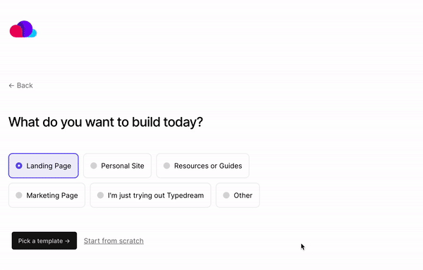
Templates
Start your site from a template or from scratch:
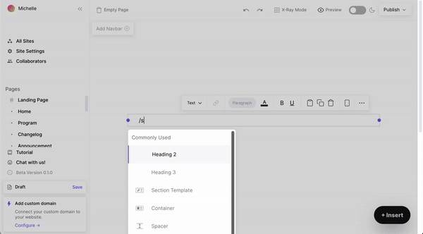
Section Template
Even if you start from scratch, you can quickly get the barebones done using our /section-templates for your Hero section, Features section, Footer, and more.
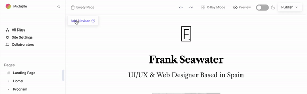
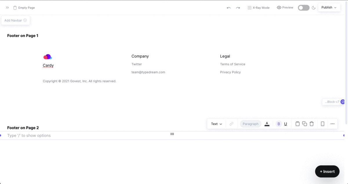
Navbar and CTA/Button
Add a navigation bar using the "Add Navbar" button.
To add a dropdown menu to a navbar item, select a navbar item, click Type → Dropdown.
For style, choose either big box or card. Add items or columns using the two buttons at the bottom of the dropdown menu.

Type /button to add a CTA.
Containers
Containers as Cards
By setting the style of the container to Card, the container will automatically have a rounded corner and drop shadow.
Containers as section backgrounds
By setting the container width to Max-Width and stretch it vertically, you can use it as a section. You can put all your contents inside that container, and then set a background on the container to make it appear as a section.
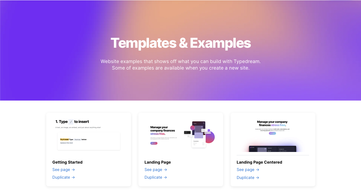
Example: "Templates & Examples" section
Synced container
You can sync multiple blocks with the same content by typing /Synced Container. Use Synced Container to display the same container in multiple pages, such as footer.
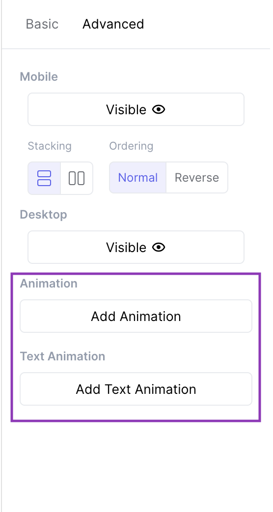
Animations
Text animation
Highlight your text, go to the Advanced tab, click "Add Text Animation" → "Scroll Words". Then add or remove words.
Component animations
Select a container, image, button, heading, or text block. Go to the Advanced tab, select "Add Animation", and choose from our preset animation styles (fade in, shrink in, slide in, grow in).
Animations are activated on scroll.
Link to a section on your page
Link a button to jump to a specific section on your site. Here's an example:
Guide: click here.
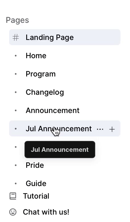
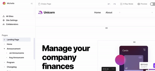
Rearrange Pages
Rearrange your pages: top-level pages and subpages.
Example:
Top level pages: Home page, Pricing Page, and Announcement Page
Subpages inside the Announcement page: Jul announcement, Aug announcement, etc.
You can nest these subpages under your top-level Announcement page:
Collapse / Hide Side Bar
Collapse the side bar to focus on editing:
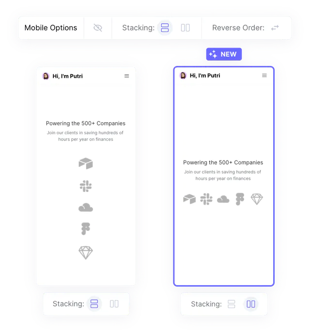
Mobile Options
You can now change some options for mobile view. For example, for Columns, you can change the stacking in mobile to be horizontal or vertical, giving you more control on the elements that you have on your site.
We're a remote software company, building online tools for creators, builders, and side hustlers. We quit our 9-5 to pursue our dreams, and we want to help others do the same.
Copyright © 2025 beehiiv, Inc. All rights reserved.
Made in Typedream