Choosing A Font to Make Your Landing Page Pop
2022-04-18
Choosing a font for your site is not easy👀. Here's how we picked a font + a couple tips on how to make it POP on your site😉
Choosing a font for your site is not easy👀. Here's how we picked a font + a couple tips on how to make it POP on your site😉
Why is Typedream's default Font: Inter?
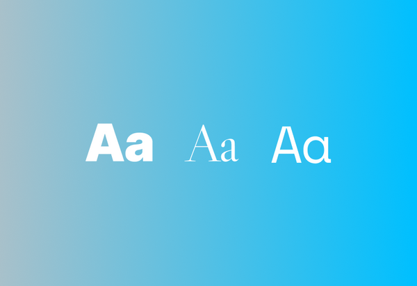
First, we checked out the sites that we love. Guess what, they all use this font called "Inter" 🤩

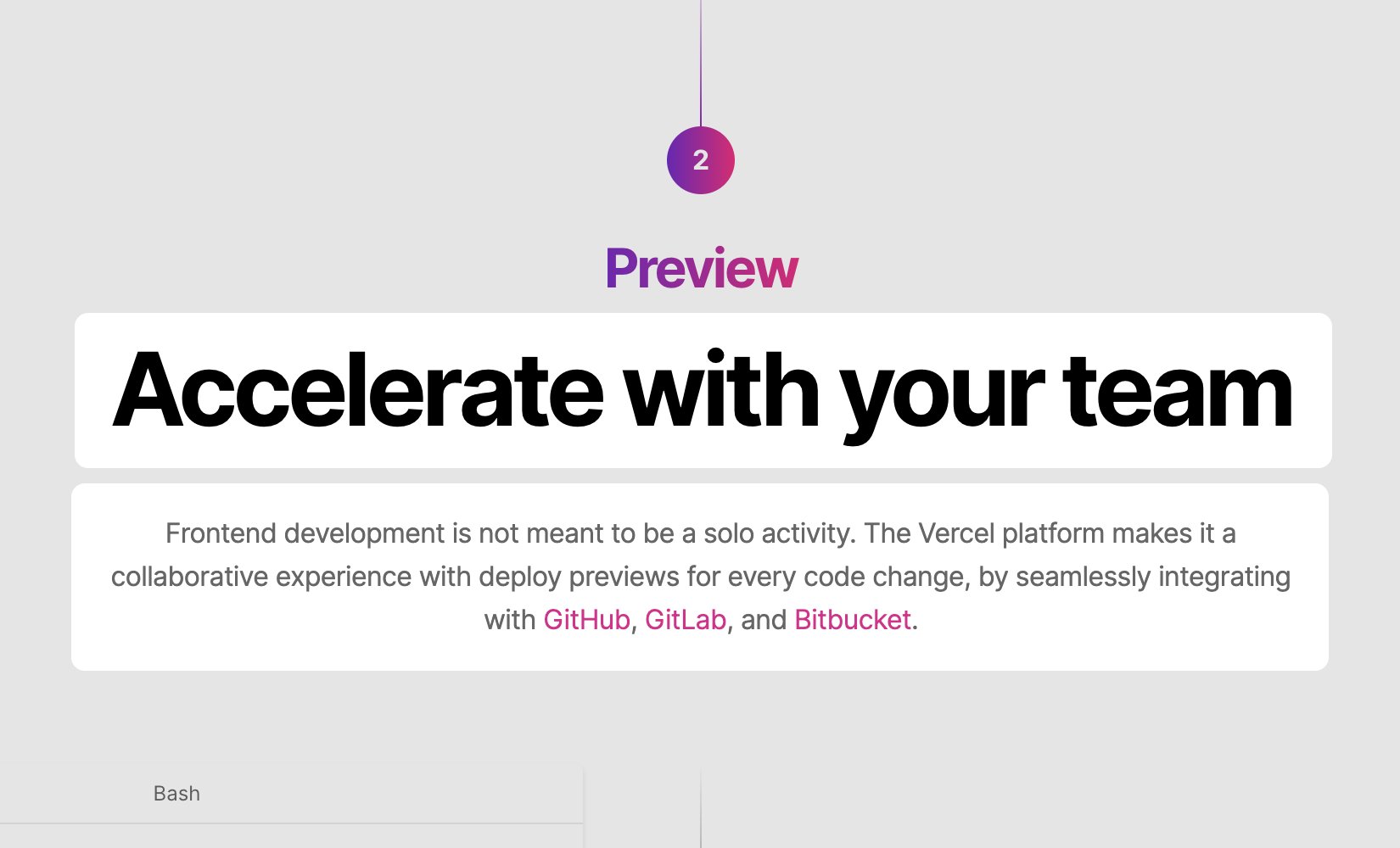
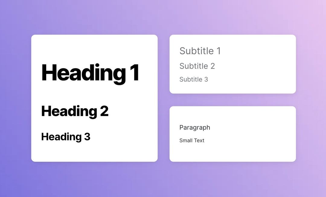
How do you use Fonts to make your site look great?
- Big, bold & black or colorful headings
- Normal-sized grey subtitles
This is the perfect combination to make the headings pop and make your site looks great and easy on the eyes 👀
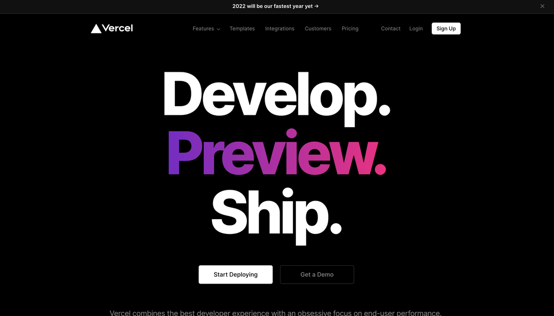
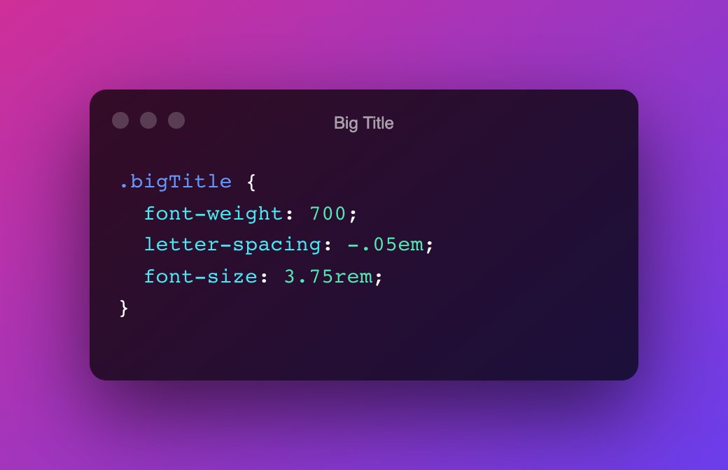
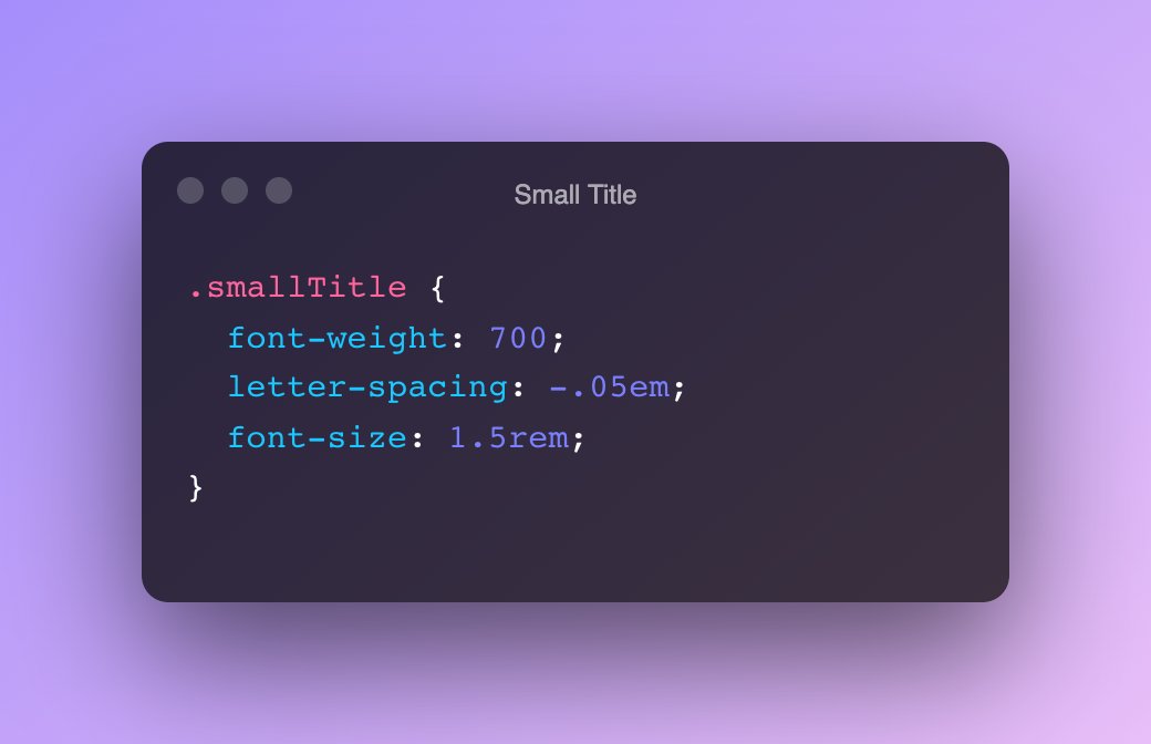
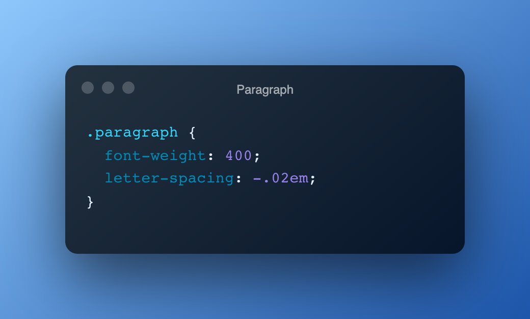
A tip on how to make the headings look better: Letter Spacing! 🤓
Take a look at the pic below, negative letter spacing looks great on big headings!
👇 Check out the #CSS below
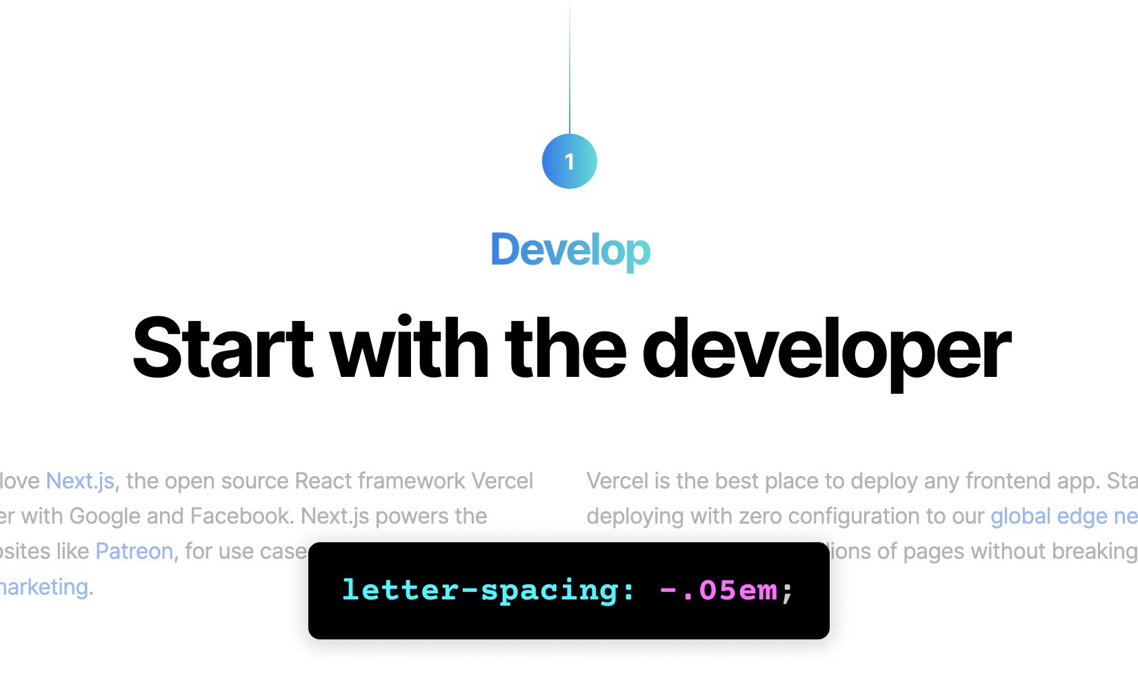
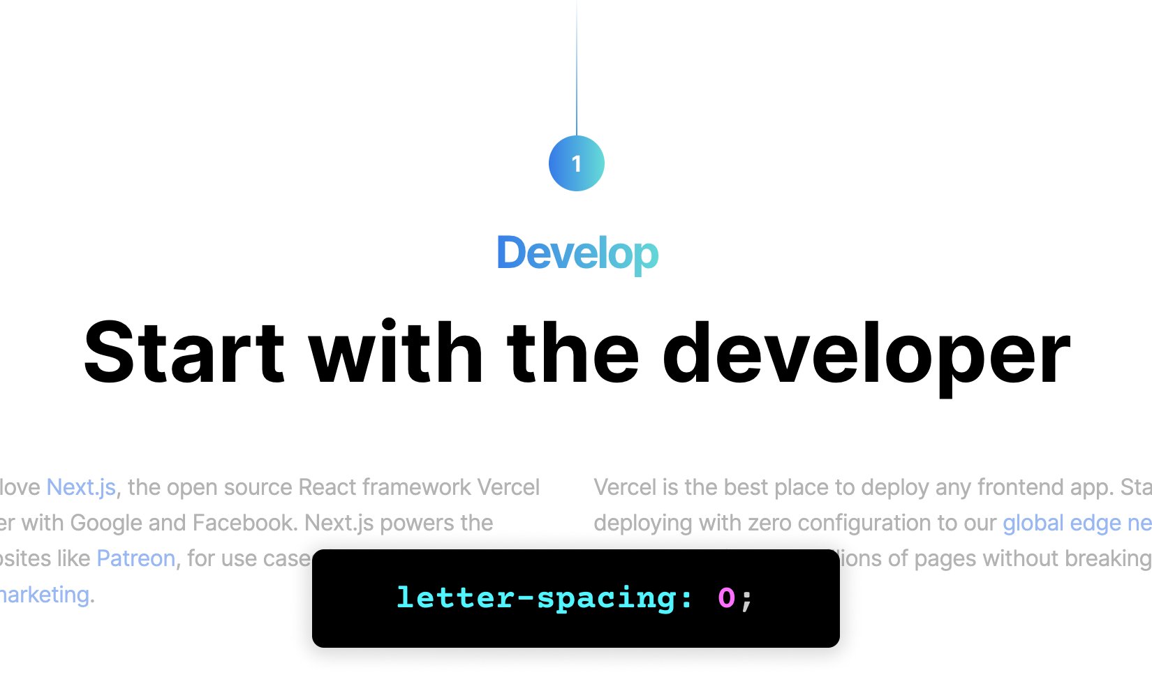
The CSS for Headings and Paragraph on Vercel's Landing Page 😉
And of course, we made this the default style on @typedreamHQ 🎉
See More Posts


We're a remote software company, building online tools for creators, builders, and side hustlers. We quit our 9-5 to pursue our dreams, and we want to help others do the same.
Backed by
Copyright © 2023 Govest, Inc. All rights reserved.